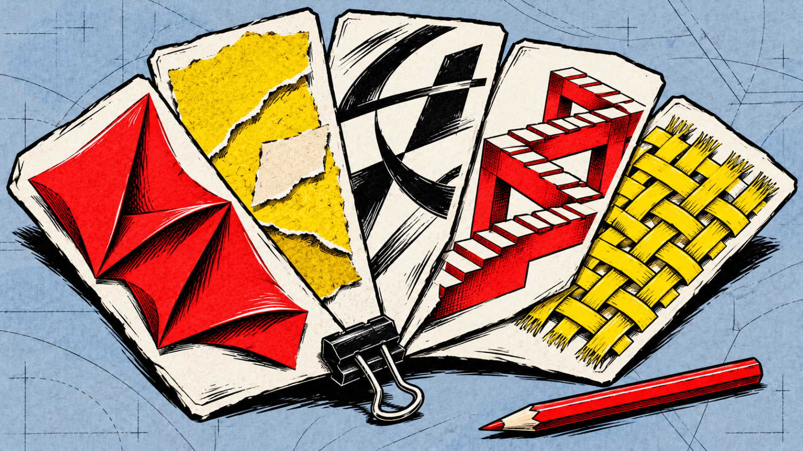
A paper texture, an oversized headline or a wonderfully strange product image can give a campaign a clear character. The useful question is what that character says about your business, and whether it still works where people will see it.
As 2026 draws towards its end, there is still plenty to discuss in the year's creative reports. Canva's 2026 design forecast highlights tactile surfaces, collage, editorial treatments and playful imagery. Adobe's January 8 account of its creative trends includes creators, stock contributors and Adobe staff discussing texture, surreal scenes and local culture.
These are vendors' selections and creative perspectives. They give us useful visual directions to explore, rather than proof of which look every customer wants. Here are five overlapping directions from those reports, with hypothetical applications to help you picture where each could fit.
1. Texture and materials you can almost feel
Think of thick paper, a grainy printed photograph, fabric, clay or the uneven surface of a painted object. Light catches an edge. A shadow makes a flat image feel like something sitting on a desk. Both reports give space to this interest in physical texture.
For a bakery's seasonal campaign, a close crop of folded paper and flour-dusted hands could help explain the care that goes into the product. A furniture maker might use detailed material photography so people can see the grain and finish. Choose a surface that has something to do with the offer; a random paper overlay adds much less.
On a website, give texture room around the message. Fine lettering on a busy surface can become difficult to read, especially when the image crops differently on a phone. Keep important copy on a sufficiently clear background and check the actual result. The W3C's explanation of text contrast is useful here. Contrast is one check, not a complete accessibility assessment.
2. Collage and deliberately imperfect marks
Cut-out photographs, torn edges, pencil annotations and slightly misaligned pieces can make a composition feel assembled by hand. Canva's report includes this kind of layered, imperfect treatment. The appeal is in the visible arrangement: somebody appears to have chosen and placed each piece.
Imagine a small music venue announcing its autumn programme. Artist photographs, snippets of the neighbourhood and handwritten-looking dates could make an energetic poster or social series. A workshop invitation might combine a clear photograph of the finished object with sketches of how it is made.
Keep the useful information easy to find. If every label tilts, overlaps or looks like a different scrap, people have to work to discover the date and booking link. A consistent place for those details lets the surrounding artwork be more expressive.
A hand-made appearance describes a visual result. It does not tell you whether the work was drawn, photographed, assembled digitally or made with AI assistance. Ask about the process and asset rights if those matter to your commission.
3. Editorial layouts and typography with a voice
Picture a magazine spread: one large headline, an unexpected crop, a generous margin and a small caption that rewards a closer look. Canva's editorial direction draws on that visual language. The typography carries some of the personality, while spacing gives the reader a route through the page.
This could suit a report launch, a specialist publication or a campaign with a strong point of view. A consultancy explaining one finding might give that finding a large, carefully set headline and use a quieter layout for the explanation below. The treatment works best when there is something worth reading.
Expressive type needs room and restraint. A narrow, decorative headline that looks good on a poster may wrap awkwardly into six lines on a phone. Try the real words, including longer translated titles, before approving the design. Keep body text and everyday controls comfortable to read.
A campaign landing page
A large headline and striking opening image can introduce one message. Give the explanation, price or booking details a clear place beneath them.
An everyday account screen
People need to recognise labels, read information and complete familiar actions. Carry the brand through colour, spacing and selected imagery while keeping those actions clear.
The same brand can use both. A calm page and an expressive campaign image can belong together when they keep recognisable colours, type or other identity cues. They serve different moments in the conversation.
4. Playful scenes that bend reality
A tiny person beside an enormous everyday object. A familiar room with impossible proportions. A product floating through an unexpected landscape. Surreal imagery gives a recognisable scene an unexpected twist. Both Canva and Adobe include playful or surreal directions in their 2026 material. In Adobe's article, artist Luke Choice discusses his own surreal practice.
For a fictional luggage campaign, a suitcase opening onto an entire mountain landscape could communicate the promise of a trip. For an event, an impossible arrangement of familiar objects might express the theme more clearly than another photograph of a stage.
The image still needs a connection to the message. If people remember the strange scene but cannot tell what you offer, the idea needs work. Keep a clear product photograph or factual description wherever someone needs to judge the actual item. An imaginative campaign picture should not leave them guessing about its size, finish or included parts.
5. Imagery rooted in a particular place
Adobe's report gives attention to local culture and the creators who interpret it. Visually, that might mean a particular building, regional lettering, a craft technique or a pattern with a known history. The detail comes from somewhere specific, rather than a general collection of fashionable symbols.
A regional food producer could commission photographs of its actual surroundings and work with a local illustrator on the packaging. A cultural event might develop its graphics with artists who know the place and its stories.
Specificity needs care. Check the meaning and permission to use cultural motifs, credit contributors as agreed, and allow time for people with relevant knowledge to review the work. A decorative pattern alone proves neither local production nor environmental responsibility. Claims about the product still need their own evidence.
Choose the visual direction for the message and the place it will appear. A temporary campaign gives you a smaller commitment than changing the identity people already recognise.
Bring one real application to the design discussion
You do not have to combine all five directions. Pick the one that helps explain your message, then ask to see it in something you will actually use: one advert, a product label or the opening of a landing page. Use real words and a realistic crop. A beautiful full-size moodboard cannot show whether a small advert is readable.
Decide which familiar cues should stay, such as your logo, a colour or a recognisable photographic approach. Then compare the proposal with the job it needs to do. Can people understand the offer? Does the treatment fit the product? Can you keep producing suitable images after the launch?
A whole rebrand deserves a wider reason than an annual trend list. A campaign can be a good place to explore a new treatment while the rest of your identity remains familiar. If you want help choosing or applying a direction, our design services cover identity, interfaces and graphics, with the deliverables and scope agreed for the project.
Questions about using 2026 design trends
Does a design trend justify changing our logo?
A trend can start a useful discussion, but a logo change needs a reason connected to your business and recognition. Try a suitable treatment in a campaign first if the identity itself still serves you.
Can a bold campaign sit alongside a calmer website?
Yes. Keep recognisable identity cues and give each surface a clear job. The campaign can carry expressive imagery while the website makes information and everyday actions easy to use.
Does a hand-made look mean no AI was used?
No. Texture, collage and imperfect marks describe the appearance. Ask how the assets were produced and what rights you receive when the process matters to the project.
What should we check before using texture or decorative type?
Try the real text at its intended size, including phone crops and relevant languages. Check legibility and contrast, and keep important details and controls clear.